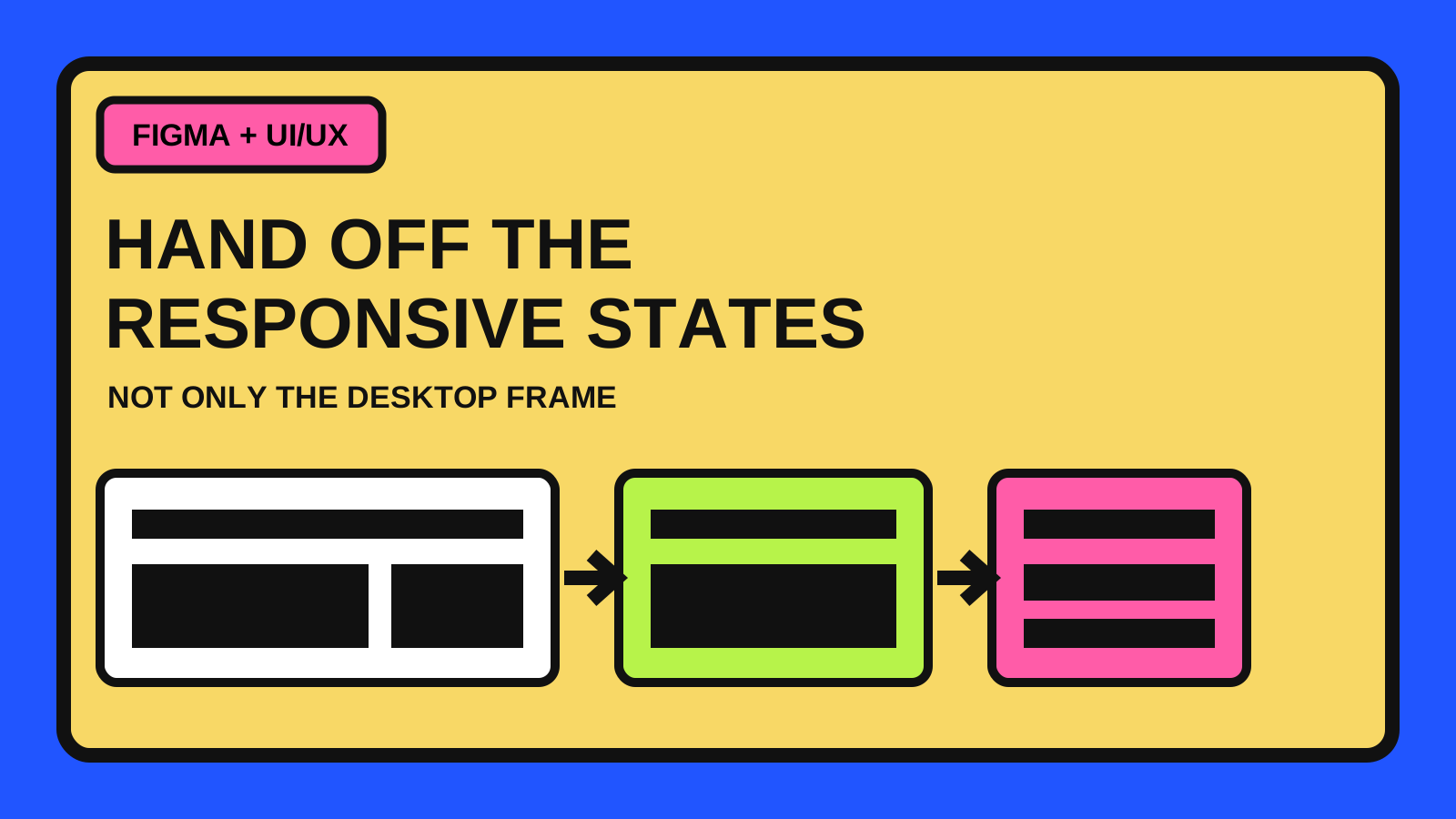
A desktop frame shows an appearance, not the responsive rules
A polished desktop screen can communicate hierarchy, color and spacing, but it does not explain what happens when the available width changes. Developers still have to decide when columns stack, which items wrap, how navigation collapses, what happens to long labels and whether media crops or scales.
A useful handoff makes those decisions visible. It does not need a separate mockup for every device. It needs enough representative states and annotations to describe the system between them.
- Show the wide composition and at least one meaningful narrow state.
- Add a middle state when the layout changes before it reaches mobile width.
- Describe the transition rule instead of naming only a device.
- Include real or deliberately difficult content so wrapping behavior is visible.
Choose breakpoints when the content stops working
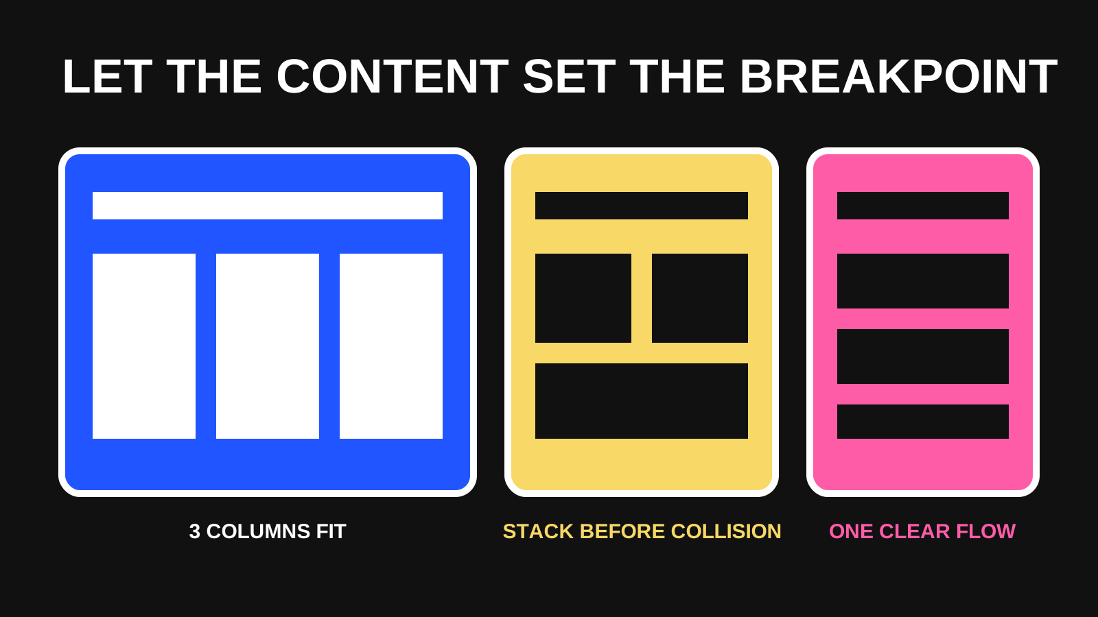
A breakpoint is useful when the current composition no longer preserves readable text, usable controls or clear relationships. It should answer a content problem, not imitate a list of popular phone and tablet widths.
The responsive design guidance on web.dev recommends choosing breakpoints based on content because device sizes change. In practice, resize the frame until something becomes cramped, collides, wraps badly or creates an awkward reading measure. Place the state change just before that failure.
- A three-column card group becomes two columns when cards fall below their useful minimum width.
- A horizontal header becomes a menu when navigation labels no longer fit without collision.
- A side panel moves below the main content when both columns become too narrow to scan.
- A data table keeps its meaning through a documented scroll, priority-column or alternate-card treatment.
Use Figma to express relationships, not fake browser behavior
Auto layout is valuable because it can expose intended relationships: padding, gaps, alignment, wrapping and whether an element hugs its content or fills available space. Constraints can describe how layers inside ordinary frames remain pinned, centered or stretched as their parent changes.
Those settings improve the design file, but they are not a substitute for a written decision. A developer still needs to know whether an unusual result is intentional, whether an element may disappear and which content takes priority.
- Name frames by state or width, such as Wide 1440, Middle 900 and Narrow 360.
- Use the same component instances across states when the component identity is unchanged.
- Use variants for genuine states such as expanded navigation or compact cards, not for every arbitrary width.
- Annotate exceptions where the implementation should not simply mirror the Figma resizing result.
Write a small state specification beside the frames
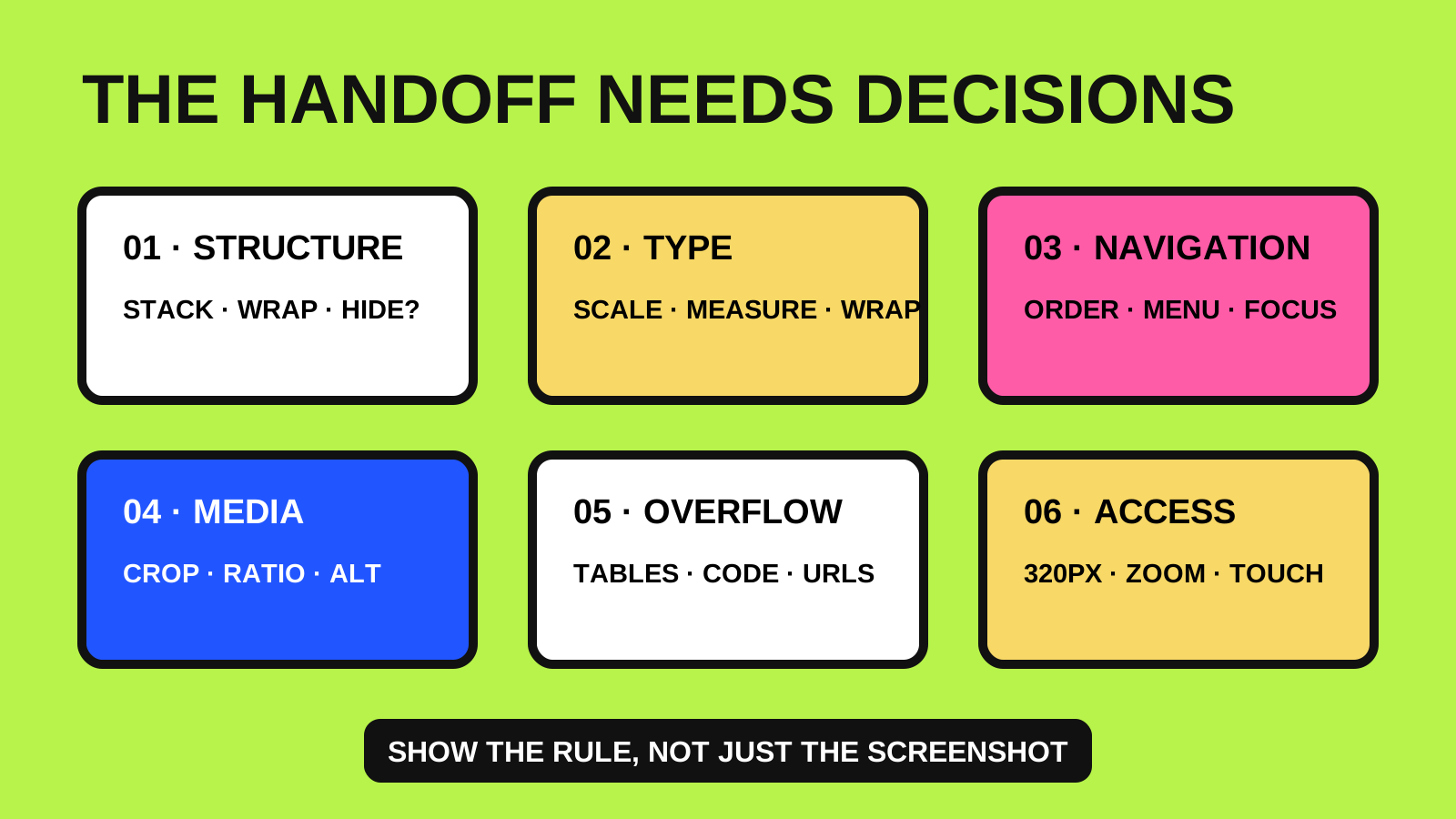
A compact specification prevents comments from becoming the only source of truth. For each responsive region, identify what stays constant, what can flex and what changes at the next state.
Avoid describing implementation details that the design cannot justify. The handoff should explain the intended behavior and priority; the developer can choose the most suitable CSS structure with the team.
- Container: maximum width, page gutters and narrow-state padding.
- Grid: column count, minimum item width and stacking order.
- Typography: maximum line length, wrapping expectations and any scale change.
- Navigation: visible items, menu trigger, focus order and expanded state.
- Media: aspect ratio, crop position, minimum height and whether art direction changes.
- Exceptions: tables, code, maps or diagrams that legitimately need two-dimensional space.
Include accessibility in the narrow-state review
Responsive handoff is also an accessibility task. WCAG 2.2 Success Criterion 1.4.10 requires most vertically scrolling content to reflow at a width equivalent to 320 CSS pixels without losing information or functionality or requiring two-dimensional scrolling. Some content, such as a data table whose meaning depends on two dimensions, can be an exception, but the treatment should still be deliberate.
Review keyboard focus order after visual reordering, long words and URLs, text enlargement, touch-target spacing, error messages and controls that appear only in compact navigation. A narrow screenshot that looks tidy can still hide an unusable sequence.
- Check the page at 320 CSS pixels and at enlarged text settings.
- Confirm DOM and keyboard order still follow the intended reading order.
- Do not remove important actions only to make the layout fit.
- Document where horizontal scrolling is intentional and keep it inside the relevant component.
Use this responsive handoff checklist
Before marking a screen ready for development, review the states with the person implementing them. The conversation is faster when both people can point to a rule, a difficult content example and an expected result.
The goal is not to produce more frames. It is to remove high-impact ambiguity while leaving normal implementation choices with the developer.
- Wide, middle when needed, and narrow states are present.
- Breakpoints are tied to content failures rather than device labels alone.
- Stacking, wrapping, visibility and reordering rules are written down.
- Navigation and interactive component states are included.
- Long text, empty content, errors and dense data have been tested.
- Images have documented crop behavior and meaningful alt-text intent.
- The 320 CSS pixel reflow and keyboard order have been reviewed.
- Open questions have an owner instead of being left as hidden assumptions.
A good handoff describes a system, not a collection of screenshots
Responsive design is the behavior between frames. When the handoff identifies content-led breakpoints, layout priorities, component changes and accessibility boundaries, implementation becomes a shared translation instead of a guessing exercise.
Start with one important page and document only the states that change a real decision. Reuse those rules across the rest of the interface, then update the design system when the implementation reveals a better pattern.